Get Started
Overview

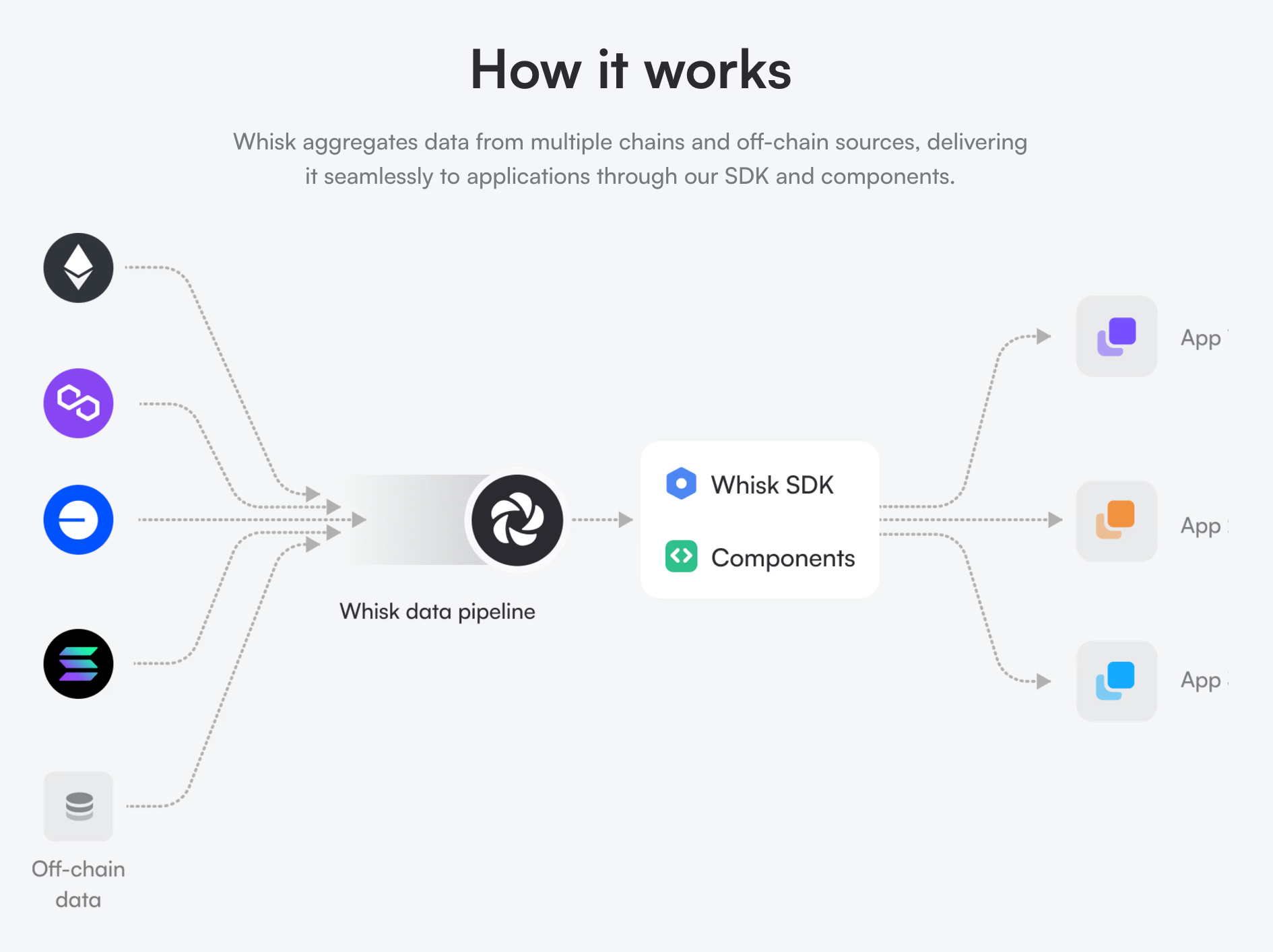
Whisk contains a number of kits:
- Chain Kit: Chain metadata for all supported chains.
- Token Kit: Metadata, prices, and balances for thousands of tokens.
- Morpho Kit: Morpho vaults, markets, positions, and rewards.
- Identity Kit: Resolver for crypto-native identity systems across multiple ecosystems.
- And more...
Don't see a kit you need? Lets chat!
Playground
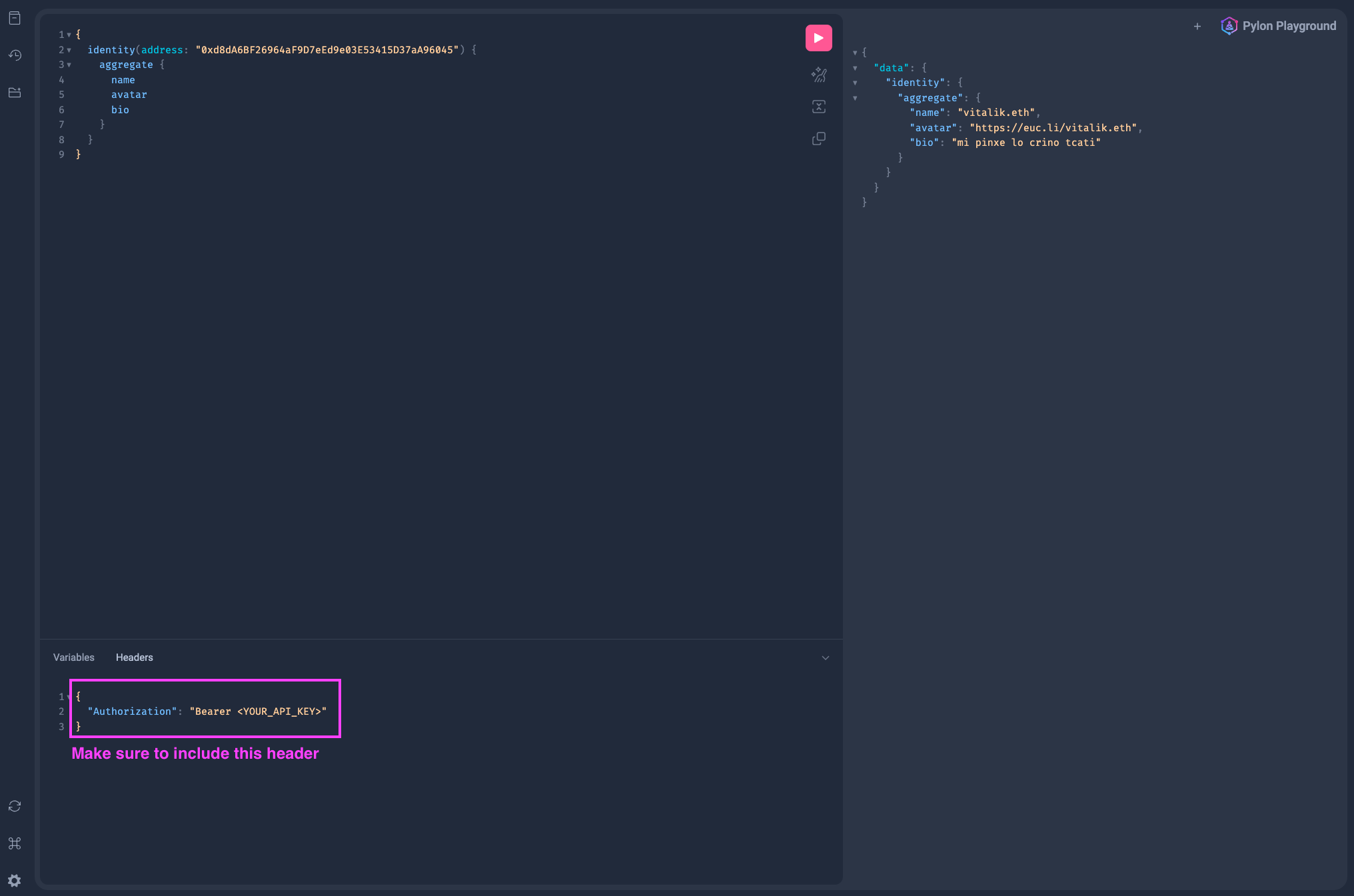
The Whisk GraphQL playground is the best way to explore the APIs comprehensive schema docs, and test queries:
Get your test API key
Book a quick call to discuss your use case, and get a trial API key to see if Whisk is the right fit for your application.
Add authorization header
In the Headers section of the playground, add the following:
Headers
{
"Authorization": "Bearer <YOUR_API_KEY>"
}Query the API
Try running a query like this:
Example Query
{
morphoVaults(where: {chainId_in: [137], whitelisted: true}, limit: 10) {
items {
name
totalSupplied {
formatted
usd
}
}
}Example of how to use the playground:

Typescript SDK
The Whisk Typescript SDK provides a type-safe GraphQL client powered by gql.tada. See the SDK guide to get started.